My brand identity will have a lot of fire in it, and a phoenix forming from the fire. This would give people a lively feeling or make them think automatically “we rise from the ashes” as this thought is usually associated with a phoenix. I chose the phoenix because of the inner meaning it has. In most cultures the phoenix means “Rebirth”. My brand would have the colors of fire, Red, Orange, and a tinge of blue.
The blue is the hottest part of the fire, but I would only use it as an accentual color. The primary color would be Red. I feel this is a perfect symbol for me because I had been put down my whole life about how I couldn’t do something. This includes the ability to attend college much less graduate, only very few people believed in me. I got knocked down for many years and believed what those who lacked faith in me said when they would put me down.

I feel that choosing this brand and sticking with it and the guidelines I set for myself will only strengthen my bond with my client. (Is bond the right word for it?), I feel that by doing this, my client will find they can closely relate to both my personal and professional experiences in a sense. When I am a client of some company, I know I would rather feel like I connect to the company on a professional and personal level and I hope my brand gives this feeling to my clients.
My products that I will be offering are Graphic Arts, Video Editing, Photo retouching, and Photo Restoration. My target audience will be those from ages 16-50 for personal usages as well as the business market. My brand will be professional. We will take the time to make sure the client is 100% satisfied including offering a redo if they found themselves unsatisfied at no extra charge. Our number 1 priority would be client satisfaction.
![]()
My brand will be bold and eclectic. We will be willing to go where a lot of companies will not be willing to go. The porn industry would not be turned down simply because they are an adult industry. We will be loyal to our clients. We are creative and always find a way to ensure our clients happiness.
We will go out of our way for our clients and this is the type of reputation we want associated with our brand. Our brand’s core values will include reputation, teamwork, loyalty, and professionalism. Our tagline will be “Where we bring art to life.” Even though we specialize in Digital Art, we still bring art back to life and that is the image we want to give others with our brand and tagline. A lot of people are into art.

My brand will tell my clients that I will bring their art to life. The clients give me the ideas and I make it a reality. We are Kitten Graphic Designs. We offer a wide variety of Graphic Arts including but not limited to Video Editing, 3D Modeling, Illustrations, Image Editing, Web Design (HTML), animation, tutorials (Both flash and video oriented), online portfolio building, and last but not least Photo restoration. Our skills include digital media, visual communications principles, flier and poster printing, photo restoration, creative design layouts, and last but not least, video editing.
We use Adobe Premiere Pro, Adobe Photoshop, & Adobe Dreamweaver.

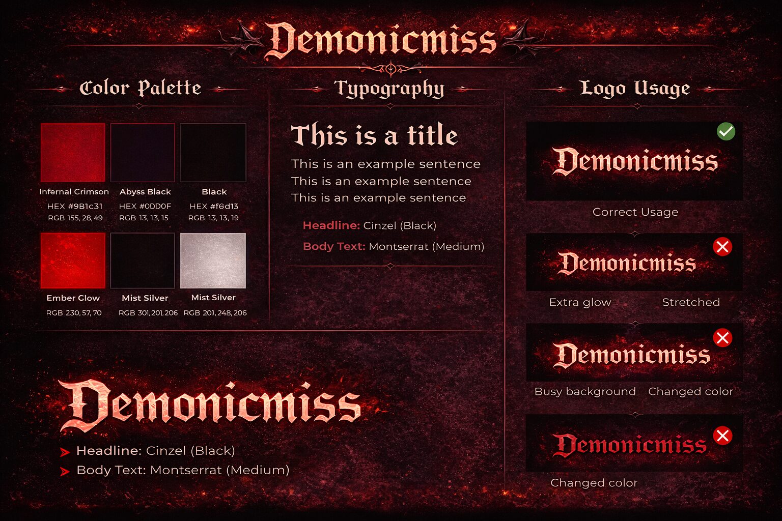
My brand name will be “The Phoenix”. My company name is Kitten Graphic Designs. I felt like choosing the phoenix as my name for the brand was appropriate seeing as it is a phoenix or at least will have the colors of the Phoenix. My brand symbolizes the rebirth, creativity, and the life of Kitten Graphic Designs. As per http://www.whats-your-sign.com/symbolic-meaning-of-the-phoenix.html which explains the specific meanings of the Phoenix symbol. After careful study and research I found I connected with the Phoenix on a personal and professional level.
This should be communicated clearly through the fire and lovely colors the phoenix naturally has. I will need to enhance the look of the phoenix to make it give people the “awe” feeling I am hoping for when they see my brand and the name of my company. The font I will use for the Phoenix Brand will be a font titled Phoenix One.

I chose this font because of the title and it does look like there is some fire going on in it, so this could really make my brand “pop” out some if I use the big lettering and give it a stroke or drop shadow effect, with a gradient from red-orange, making the stroke somewhat blue.
There is a second font that is similar called Phoenix two, if Phoenix one ends up not working well for me, I could always go with Phoenix two. The font is a courtesy of www.dafont.com where you may download free fonts to use for designs or other purposes in regards of Microsoft programs, Adobe Programs, and more.

My logo will be a phoenix; its color will be RGB as that seems the most logical of color choices for my logo being a Phoenix. The Red color goes perfectly with the phoenix being that is one of the colors. The phoenix has red, orange, and yellow in its colors. RGB seems to be the one where I can get the color choices and schemes just right. It was a battle between CMYK and RGB but after going through each one personally and testing how colors and images looked between the two, RBG became the final choice.
The background colors of my logo would have a mixture of orange and black, working to create a dusty fiery smoke cloud that would hopefully enhance the look of my font and phoenix. I would also use a tint of yellow in specific areas so as to add some white space without having a splotch of white to make it look well done. This brand will not just follow the guidelines I set for it, but the design principles that are laid out in training that each Graphic designer should follow.
My logo will be approximately 5 x 4, so this way I can place it on artwork or websites without it covering the full project given allowing for my work to be desirable. When on a business card, it will be able to be resized and still be viewed so people can see the logo and my name clear as day. When placed on a business card it will be approximately 5 x 2 to allow the logo to be viewed and remain legible.

My tagline will be “Where we bring art to life”. This tagline would be better used on business cards, on the website, or advertisements. I would usually use it with fire or on a phoenix because doing so would help to enhance the bringing art to life message I am portraying. With Phoenix meaning “Rebirth” and its primary color fire I think the two go hand in hand. It should be a stylish text and not something bland or pain. It should not be too big or bulky and should be really eye popping.
The spelling should be accurate, with punctuation. We don’t want clients to think we are uneducated and cannot spell correctly. They would more than likely think “if they can’t spell these simple words, then how can I trust them to design my design or do what I am asking correctly.” You have to put yourself in a client’s shoes in some cases, such as this one. If it is something that would bother you, then it may bother your potential clients.

The color should come from the Red primary color in the color wheel. This would include an orange, a red, even a light pink but we would not use light pink. We would use orange and red primarily. Some of the orange would be very dark to where it almost looks black but it’s not. You should make it noticeable that there is a phoenix or make them think of the phoenix when they see the color. They need to be reminded what our logo is, what our tagline is when they see the colors.
The typography should be done with the Phoenix One font. If that font will not work with the size, texture, or any other elements then you may substitute it for Brush Script MT. Just resize it so that this font will work nicely. It should be a red color or orange, but preferable red on the font. You may add a gradient if you wish to add a bit of Orange to red or Orange to yellow look to have it match the logo if this tagline will go anywhere near the logo it should look it belongs there.

My color palette will consist of Red-dark red, orange, and even a tinge of yellow for highlights. I will use the yellow to create highlights, gradients, and shadows where they usually would be. It would consist of Dusk red, Red-Orange, Neon Yellow, Dark red, Blood red, and Red. The mixture of these colors would create the look I am going for. The color palette for my brand I am after would be created upon using these colors. In the end it would look like there is a lot of orange used when in reality it isn’t. It would just be the way it looked mixed with the different colors of red.
The Primary color would be red. I chose red because again…Phoenix + Fire=Red. At least how I look at it and I always put myself as a client when thinking of stuff. Like ‘How would I look at this if I was a client” and then I make sure the idea is an original idea. This includes my color scheme and palette. Although, other companies may have the same color palette, I did not see many with the phoenix as their brand or logo.

My secondary color would be Orange. I chose orange because it closely resembles red (Yellow and red make orange). Orange also is another color associated with fire. If you look at a fire it’s not just red. Fire has orange, red, and blue though the blue is not noticeable.
The tertiary colors I would have are yellow-orange and red-orange. I feel these colors would add the spice to the brand. These colors would also help enhance the primary and secondary colors of my brand as well. These colors will help shape the brand into what I want it to be.

I will use one of these three fonts: Phoenix One, Phoenix Two, or Brush Script MT. The decision to use one or the other depends on how the font looks against the rest of the background. I will place the text where I want it, resize it till I see where it fits best, and then decide from there which font looks best. I would want it to be consistent so using all three would not be an option.
The expected font size would be 100.92 pt. I know this sounds big, but with the Phoenix One font it does not look as big as it sounds. (See the logo images and that is 100.92 pt. using Phoenix One.) The reason I am choosing this size is to make the brand lettering a legible and easy to read. If it was smaller than you might not be able to see it. If it was bigger it might take up the whole image, which is something we do not want.

I actually have a red color but added a yellowish orange gradient to it, so it brings out the Orange of the red and shows a little yellow within it. This will help brighten up the otherwise dark image in the end. It is better if I show you what I am talking about:
My font will pop and make my brand and even my logo an eye opener. I will hope that it brings in new clients and keeps the old clients around. I might even add a burnt shadow effect behind it so it looks like it is burnt around the edges from the fire or make it like it is coming through the fire, something to add to it. Not all of of my thoughts will go through because some of it might prove to be too much. Sometimes less is more in the eyes of design

We would use Envelopes that already have our address on them. The envelopes would also be fancied up and designed specifically for our business. They would have our logo as a watermark, and potentially be a light pink color as pink is really just a really light red color but within the red color palette. It would need to be a soft color to make writing on it or stamps on it easily readable.
We would use Letterheads. The letter heads would be approximately and look similar to the color of this Brand Identity Guidelines document I am currently writing on, so you have that image laid out before. On the letterhead we would have “Kitten Graphic Designs: Where we bring art to life” and then our address, phone number, etc. at the top of it in a business professional like manner. This way, people know who to return their letters back to.

Our business cards would be our logo, but resized to business card size. And we would have it with less Opacity making it a little see-through so the address and information on it would still be readable. This would be given to all potential clients as well as any current clients. We would have a copy of it on our website. This way we can get the word out about our work.
The physical address listed on the stationery elements would be N30W29315 Hillcrest Dr. Pewaukee, WI 53072. This is the address the business would be run out of. I would have an office set up there in which I could meet potential clients and hold conference calls. This allows a safe yet convenient place for customers and clients to meet with me to discuss their desires.

The phone number I would use is 240-262-0346. This phone number would be used strictly for business purposes in a place for my contacts to call me. I would make sure to include this number on business cards, letterheads, and envelopes as well as other stationery items. We need to be reachable by phone.
On the web I would more than likely use Green, white, and Black with an Arial black text. My typical fire, Phoenix One font does not seem that it would suit me very well. I chose a dark green; it’s more like hunter green or forest green. This way it still gives a friendly feeling. The feeling may even reveal how Eco-friendly we can be. Everything we offer would be on recyclable paper. Some of our elements and choices within the business would be considered Eco-friendly.

The buttons would be in link style. I would create a table and then add the links I am after to the text in the table. This would create a button however; it would be more like an underlined link. The table would give off the image of a button. It is proficient, easy to change, and less time consuming. When you hover the buttons it should change the color of the button showing it has not been pushed yet.
The color palette for the website would be green. I would use black lettering, and the links before clicked would be yellow, after being clicked they would be purple or white. This is what I feel would work best for my site. I hope that it ends up working out the way I hope and looks like how I want it to look. Most people would find it plain but sometimes less is more.

My email signature block, I do not really have one. However, in the contact me section I would have the contact information centered and the site would link directly to my email so if they clicked my email address it would open up outlook or their email program for them to send me an email. I would have it typed out instead of just saying “Email” with the link to my email address. The reason for this would be because if they have an issue and it automatically brings up outlook but they don’t use outlook, then they could just as easily copy it and paste it in the to box of their email account to compose the email to me.
There are so many different kinds of social media. I would try to utilize as many of them as I possibly could. The reason for this is because you have no idea what people use. Not everyone uses Facebook, some still use Myspace. So, I would try to make as much of them as possible. One that I would most definitely utilize is Deviant Art. I think a lot of designers forget about this one, it is where you may sell your designs and show it off. If you show off a few pieces of your work, you may end up with a client in the future even if they are not buying your art from deviant art. (Brody, 2014)

I would utilize Facebook. Facebook is the most popular form of social media as of today. I would be able to give updates about sells, new work. It is also a place I can show off work and network with other businesses to try and obtain clients or potential clients. I could do this in a page setting, group setting, or even a personal Facebook setting. (Brody, Kitten Graphic Designs, 2013)
I would use Myspace. Myspace has changed a lot it looks like it is more to connect with celebrities. As a graphic designer this might be the kind of exposure I will need. But it also connects me professionally with people in the same field as me. I would utilize that and share my work there and updates as well. (Brody, Larabeth30)

I could use this other social networking site called Meetme. It has gotten fairly popular in the past year since they made some changes. This would allow me to show everyone who uses that site my work. Sharing and showing off my work in as many places as possible would allow me to get as many potential clients as possible. (Brody, Cats Meetme)
Last but not least, I would most definitely use Linked in. Linked in is the most famous for professional and business networking as well as obtaining clients.

Works Cited
Brody, C. (2014, April). Kitten Graphics. Retrieved from Deviant Art: http://kittengraphics.deviantart.com/
Brody, C. (n.d.). Cats Meetme. Retrieved from meetme.com: http://www.meetme.com/member/21384351
Brody, C. (n.d.). Larabeth30. Retrieved from Myspace: https://myspace.com/larabeth30